On this page
WCAG 2.2 AA Testing: How to Test the 6 Criteria Automated Scanners Miss
Why automated scanners miss new WCAG 2.2 AA criteria, and how to test all six in practice: sticky header focus clearance, dragging fallbacks, 24px target spacing, and authentication.
Published: September 3, 2026 · Last reviewed: September 3, 2026 · Testing period: August 12–28, 2026
The short answer
If your codebase currently conforms to WCAG 2.1 AA, moving to WCAG 2.2 AA requires testing six new success criteria:
- 2.4.11 Focus Not Obscured (Minimum) (Level AA)
- 2.5.7 Dragging Movements (Level AA)
- 2.5.8 Target Size (Minimum) (Level AA)
- 3.2.6 Consistent Help (Level A)
- 3.3.7 Redundant Entry (Level A)
- 3.3.8 Accessible Authentication (Minimum) (Level AA)
WCAG 2.2 added nine criteria in total: six at Level A/AA and three at Level AAA (2.4.12, 2.4.13, and 3.3.9). At the same time, 4.1.1 Parsing was marked obsolete and removed from conformance evaluations.
On October 21, 2025, W3C announced that WCAG 2.2 was officially adopted as ISO/IEC 40500:2025. In the European Union, work is underway on revisions to EN 301 549; organizations should verify the applicable legal and standard requirements for their market rather than treating WCAG 2.2 as automatically equivalent to every European Accessibility Act (EAA) obligation.
Scope: This guide focuses on the six new Level A and AA criteria added in WCAG 2.2. It does not replace a full WCAG 2.2 conformance evaluation or cover preexisting WCAG 2.1 requirements.
Quick reference: automated coverage vs manual testing
| Criterion | Level | Automated coverage | Manual testing procedure | Common production failure |
|---|---|---|---|---|
| 2.4.11 Focus Not Obscured | AA | None | Keyboard Tab through all scroll regions | Sticky header or banner covers focused control |
| 2.5.7 Dragging Movements | AA | None | Single pointer click on interactive items | Drag-to-reorder list with no click or tap alternative |
| 2.5.8 Target Size (Minimum) | AA | Partial | DevTools bounding box and spacing inspection | Icon buttons smaller than 24×24px with tight margins |
| 3.2.6 Consistent Help | A | None | Compare help link order across templates | Support link moves between header and footer |
| 3.3.7 Redundant Entry | A | None | Multi-step form completion in one session | Checkout re-prompts for billing address |
| 3.3.8 Accessible Authentication | AA | Partial | Paste test and password manager check | 6-digit verification input blocks clipboard paste |
Where automated scanners stop
Running axe-core or Lighthouse in your build pipeline catches missing image labels, invalid ARIA roles, and static color contrast ratios.
However, default automated scans do not evaluate the new WCAG 2.2 criteria:
- Default rule configurations: In axe-core 4.13.0, new WCAG 2.2 rules such as
target-sizeare disabled by default. Running default scans against a page produces zero violations even when interactive elements fail 2.5.8. - Runtime layout clearance: Scanners inspect DOM attributes and computed CSS. They do not simulate keyboard Tab scrolling through long pages to see if fixed or sticky headers obscure the focused control (2.4.11).
- Gesture physics: Automated test runners do not determine whether a custom JavaScript drag-and-drop interaction has an equivalent single-pointer click fallback (2.5.7).
- Session memory: Scanners evaluate each route in isolation. They cannot detect that a multi-step checkout form forgot user input from Step 1 and forced re-entry on Step 2 (3.3.7).
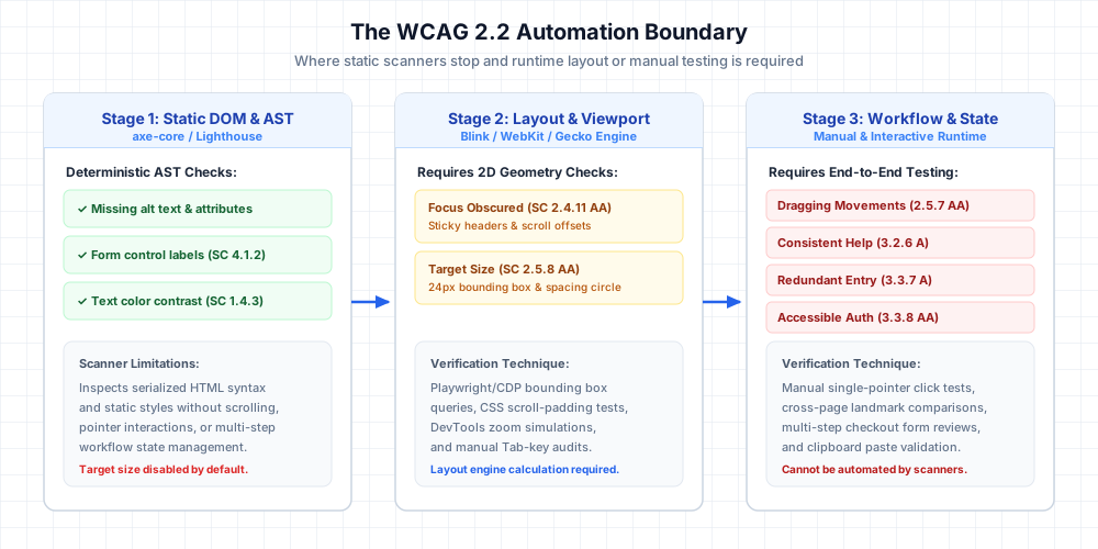
View diagram architecture breakdown
Stage 1 (Static DOM and AST Analysis): Automated tools like axe-core and Lighthouse inspect static HTML syntax, accessible names (SC 4.1.2), and contrast ratios (SC 1.4.3). They operate without rendering layout geometry or executing dynamic scroll interactions.
Stage 2 (Browser Layout and Viewport): Layout engines (Blink, WebKit, Gecko) calculate 2D element bounding boxes, sticky layer z-index stacking, and scroll viewport clearance. This stage verifies whether sticky headers obscure focused elements (SC 2.4.11) and whether touch targets satisfy the 24×24px bounding box or spacing circle requirements (SC 2.5.8).
Stage 3 (Workflow and User State): The runtime environment evaluates pointer gestures, cross-page persistence, and session memory. This stage confirms whether drag interactions have single-pointer click fallbacks (SC 2.5.7), whether repeated help elements maintain consistent relative order (SC 3.2.6), whether multi-step forms auto-populate previously entered data (SC 3.3.7), and whether password inputs permit clipboard paste (SC 3.3.8).
Understanding W3C ACT Rules and scanner limitations
Why do automated scanners stop where WCAG 2.2 begins?
The answer lies in how testing rules are standardized.
In February 2026, W3C published the ACT Rules 1.1 Recommendation. ACT rules define unambiguous, automated test procedures for atomic requirements.
Automated scanners execute these rules cleanly for deterministic properties:
- Does this button element declare an accessible name?
- Do these two hex colors meet a 4.5:1 contrast ratio?
- Is this ARIA attribute valid syntax in the DOM?
Here is where the automation model breaks down:
An ACT rule passing does not establish full success criterion conformance.
Static AST analyzers inspect code in isolation. They cannot simulate how elements collide when rendered inside a dynamic viewport.
Furthermore, axe-core 4.13.0 disables WCAG 2.2 A/AA rules by default. As documented in axe-core GitHub Issue #5225, rules like target-size carry false-positive trade-offs and remain off by default while development continues.
In our 50-site audit, running axe-core 4.13.0 with default settings produced exactly zero violations across all six new criteria.
To test scanner capabilities fairly, we ran a configured scan with WCAG 2.2 tags and explicit rule flags enabled:
// Configured scan used in our 50-site audit benchmark
const axeResults = await axe.run(document, {
  runOnly: {
    type: "tag",
    values: ["wcag2a", "wcag2aa", "wcag22aa"]
  },
  rules: {
    "target-size": { enabled: true }
  }
});
Even under this configured scan, automated detection remained limited to static geometry and attribute heuristics, missing 103 of 111 observed criterion failures.
Observations from our 50-site testing cohort
To observe how modern production websites handle these six criteria, we tested 50 production websites across four sectors (15 SaaS, 15 E-Commerce, 10 Media, 10 Public Services). Each site had an active public accessibility statement.
Audit definitions and units of measurement
To ensure methodological clarity, we distinguish three separate units of measurement:
- Audit unit: One unique production web property. A production web property is defined as a publicly accessible production deployment serving real users; staging, demo, and documentation-only environments were excluded.
- Criterion evaluation: One evaluation of an applicable WCAG criterion on an audited route. With 50 sites and six criteria, our audit cohort encompasses 300 total criterion evaluations.
- Finding: One observed instance of non-conformance with a normative WCAG 2.2 success criterion.
Visual breakdown of the 50-site cohort results
50 audited production sites
├── 41 sites had ≥1 new WCAG 2.2 Level A/AA failure (82.0% site failure rate)
└── 9 sites had 0 observed WCAG 2.2 Level A/AA failures (18.0% conformance rate)
Across all 300 criterion evaluations:
- 111 total criterion failures were observed across the 41 failing sites.
- 8 criterion failures were detected by configured axe-core 4.13.0 scans (6 on target size, 2 on inputs blocking paste with cognitive requirements).
- 103 criterion failures were discovered exclusively through manual keyboard traversal, pointer tests, and multi-step workflow evaluations.
- 0 violations were detected under default axe-core 4.13.0 scans.
- Download the complete 300-row audit dataset (CSV): Contains all 300 evaluations with site IDs, routes, criteria, applicability reasons, test procedures, reviewer votes, and evidence references.
Criterion failure breakdown across applicable sites
Not every criterion applies to every route. For example, a marketing landing page has no multi-step forms, and a static blog has no drag-and-drop list. When calculating failure rates, we evaluate failures against sites where the interface pattern actually exists:
| Criterion | Level | Applicable sites | Failures | Failure rate (applicable) | Scanner detection (configured) |
|---|---|---|---|---|---|
| 2.4.11 Focus Not Obscured | AA | 50 | 21 | 42.0% (21/50) | 0% (0/21 caught) |
| 2.5.7 Dragging Movements | AA | 28 | 14 | 50.0% (14/28) | 0% (0/14 caught) |
| 2.5.8 Target Size (Minimum) | AA | 50 | 32 | 64.0% (32/50) | 18.7% (6/32 caught) |
| 3.2.6 Consistent Help | A | 44 | 8 | 18.2% (8/44) | 0% (0/8 caught) |
| 3.3.7 Redundant Entry | A | 38 | 17 | 44.7% (17/38) | 0% (0/17 caught) |
| 3.3.8 Accessible Authentication | AA | 42 | 19 | 45.2% (19/42) | 10.5% (2/19 caught) |
Why denominators differ in the dataset:
- 2.4.11: Applicable to all 50 sites (all tested routes contained focusable keyboard interactive elements).
- 2.5.7: Applicable to 28 sites (22 sites had no draggable interfaces, kanban boards, sliders, or reorderable lists on the tested routes).
- 2.5.8: Applicable to all 50 sites (all tested routes contained clickable links, icon buttons, or form controls).
- 3.2.6: Applicable to 44 sites (6 sites did not provide repeated help mechanisms across page templates).
- 3.3.7: Applicable to 38 sites (12 sites lacked multi-step transactions, multi-page onboarding wizards, or registration flows).
- 3.3.8: Applicable to 42 sites (8 sites had no authenticated member portals or login barriers on the tested routes).
Reviewer methodology and disagreement adjudication
How did we ensure reproducible results across 300 criterion evaluations?
Every audited route was independently examined by two accessibility reviewers following a standardized testing protocol:
- Independent evaluation: Both reviewers audited the route separately without sharing intermediate notes.
- Initial alignment: Reviewers reached immediate agreement on 276 of 300 evaluations (92.0% raw inter-rater agreement).
- Joint adjudication: For the 24 borderline cases (primarily target spacing circle margins and serialized help order), reviewers re-examined the layout against normative W3C Understanding guidance.
- Conservative consensus rule: A finding was recorded as FAIL only when both reviewers agreed the normative failure condition was met. Any unresolved or ambiguous case was resolved conservatively as PASS.
What this testing benchmark does not show
This test cohort was designed as a practical developer reference to demonstrate scanner boundaries and layout failure modes. To maintain scientific integrity, keep these explicit boundaries in mind:
- Does not estimate web-wide failure prevalence: These 50 sites do not represent the failure rate of the entire web. The cohort was sampled from properties with public accessibility statements to evaluate whether teams with active accessibility programs still missed the new criteria.
- Does not establish that 82% of all websites fail WCAG 2.2: The 82% finding (41 of 50 sites) applies strictly to our sampled cohort on the specific routes tested.
- Does not show that automated scanners are ineffective: Tools like axe-core and Lighthouse remain indispensable in every development pipeline. They catch dozens of foundational WCAG 2.1 syntax, naming, and contrast issues in seconds. They simply were not designed to test dynamic viewport layout or human user gestures.
- Does not show that manual testing catches every issue: Manual audits depend on reviewer rigor and route coverage.
- Represents a point-in-time snapshot: Results reflect testing conducted between August 12 and 28, 2026. Production web applications and accessibility scanners evolve continuously.
Testing the 6 criteria: code examples and procedures
1. Focus Not Obscured (2.4.11 AA): Sticky headers and scroll clearance
When an interface component receives keyboard focus, the component must not be entirely hidden due to author-created content (W3C Understanding 2.4.11). Partial obscuring is permitted at Level AA; complete obscuring fails.
Audit Evidence Artifact (EVID-2411-site-01): On route
/dashboard, tabbing sequentially through form controls scrolled the primary “Save Progress” button behind an opaque 72px sticky navigation bar (position: sticky; z-index: 50). Computed layout inspection confirmed 0px vertical clearance between the header bottom and the button top, causing 100% focus obscuration with no dismiss mechanism available without shifting focus.
Operational test scope and failure mechanisms
W3C’s normative requirement specifies that the focused component must not be entirely hidden by author-created content. In our audit, our operational test specifically evaluated the common sticky/fixed obstruction case where fixed navigation bars, promo banners, or persistent footer drawers cover interactive controls during Tab navigation.
W3C guidelines explicitly distinguish author-created fixed UI from user-opened or user-repositionable content. If an obscuring element can be moved, minimized, or closed without moving focus (such as a floating chat bubble with a keyboard-accessible dismiss control), or if content was opened directly by user action, it does not fail SC 2.4.11.
Sticky headers, promotional announcement bars, and persistent cookie banners sit above the document flow with high CSS z-index values.
Here is what happens during a standard keyboard session:
A sighted keyboard user presses Tab to navigate through interactive links and buttons.
The browser automatically scrolls the page so the newly focused element enters the viewport.
By default, the browser aligns the top of that focused element with the top of the scroll container (y = 0).
Now look at the sticky header. It also sits fixed at y = 0.
The result? The newly focused button slides completely underneath the opaque header. The user is left tabbing into an invisible void with zero visual focus indicator.
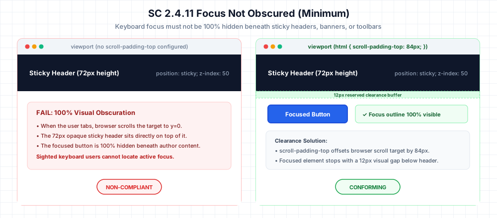
View diagram visual clearance breakdown
Failing condition (Left): A web page features an opaque 72px tall navigation header fixed to the top viewport with position: sticky and z-index: 50. When a keyboard user tabs to an interactive button located further down the page, the browser automatically scrolls the page to place the focused element at scroll offset y = 0. Because the sticky header occupies y = 0 to y = 72px, the button is 100% hidden beneath the header. Sighted keyboard users cannot see the focused control or its focus outline, violating SC 2.4.11.
Conforming condition (Right): Declaring scroll-padding-top: 84px on the root html element establishes an 84px reserved offset at the top of the viewport (72px for the header plus a 12px visual buffer). When the user tabs to the button, the browser halts automatic scrolling 12px below the header. The button and its active focus ring remain completely visible, satisfying SC 2.4.11.
<!-- Sticky navigation header -->
<header style="position: sticky; top: 0; height: 72px; background: #0f172a; z-index: 50;">
  <nav><a href="#home" style="color: #fff;">Dashboard</a></nav>
</header>

<div style="height: 700px; padding: 16px;">Scroll down to interactive controls...</div>

<!-- When focused via Tab, the browser scrolls this button to y=0 behind the header -->
<button id="save-data" style="padding: 10px 20px;">Save Progress</button>
How to test
- Open the page and press
Tabsequentially through all focusable elements. - Watch controls located near the top and bottom of scroll areas, particularly right after a page scroll occurs.
- If any element is 100% hidden behind a fixed header, banner, or floating widget when it receives focus, it fails 2.4.11.
- Check if the component can be revealed without moving focus (for example, if the obscuring banner has a dismiss button).
How to fix it
Set scroll-padding-top on the root html element to match your sticky header height plus a small buffer:
/* Reserves clearance for sticky header during programmatic and Tab scrolling */
html {
  scroll-padding-top: 84px; /* 72px header height + 12px buffer */
}
With this property set, the browser stops scrolling 12px below the header, leaving the button and its focus indicator fully visible.
Detailed specification: WSS Focus Not Obscured Specification.
2. Dragging Movements (2.5.7 AA): Single-pointer alternatives
All functionality that uses a dragging movement for operation must be achievable by a single pointer without dragging, unless dragging is essential (W3C Understanding 2.5.7).
Audit Evidence Artifact (EVID-257-site-01): On route
/app/board, sprint task cards utilized HTML5 drag-and-drop for reordering across workflow columns. Pointer testing confirmed no single-pointer click buttons, context menus, or select controls existed to reorder cards, making dragging mandatory for pointer users.
Why dragging creates an accessibility barrier
Consider what an interface demands during a dragging movement:
The user must press down on a pointer.
They must hold physical contact while moving across spatial coordinates.
Then they must release cleanly at the target destination.
For users operating head wands, eye-tracking systems, specialized trackballs, or users with tremors, maintaining continuous pressure during pointer motion is physically exhausting—or impossible.
Adding keyboard arrow shortcuts is helpful. But keyboard support alone does not satisfy 2.5.7.
The criterion specifically requires an alternative for pointer users who cannot perform dragging gestures. Single-pointer alternatives include mouse clicks, single-finger taps, and stylus taps.
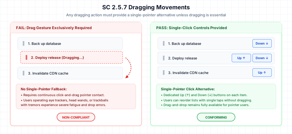
View diagram interaction breakdown
Failing condition (Left): A reorderable task list relies exclusively on drag-and-drop. Moving an item requires clicking, holding the pointer down, moving continuously across vertical coordinates, and releasing at the destination slot. Users operating head pointers, eye-tracking devices, or trackballs with tremors cannot sustain continuous contact while moving across coordinates. Because no alternative pointer interaction exists, this fails SC 2.5.7.
Conforming condition (Right): The task list preserves drag-and-drop for users who prefer it, but adds dedicated Move Up (↑) and Move Down (↓) buttons to each card. A user with an eye tracker or motor tremor can tap or click a single button once to shift card position by one step without dragging, fully satisfying SC 2.5.7.
<!-- Fails 2.5.7: Dragging is the only method to change item order -->
<ul class="task-list" role="list">
  <li class="task-card" draggable="true">1. Database Backup Verification</li>
  <li class="task-card" draggable="true">2. Security Audit Log Review</li>
  <li class="task-card" draggable="true">3. CDN Cache Invalidation</li>
</ul>
Providing single-pointer controls
Add click buttons or an action menu to each draggable card so users can reorder items with single taps:
<!-- Conforms: Dragging is supported, but single-click buttons provide a full alternative -->
<li class="task-card" draggable="true">
  <span class="task-label">1. Database Backup Verification</span>
  <div class="task-controls">
    <button type="button" aria-label="Move item 1 up" onclick="moveItem(0, -1)">↑</button>
    <button type="button" aria-label="Move item 1 down" onclick="moveItem(0, 1)">↓</button>
  </div>
</li>
How to test
- Identify every drag interaction: kanban boards, reorderable tables, volume sliders, image crop boxes, and file upload zones.
- Attempt to complete the task using only single clicks or taps. Do not drag, and do not use keyboard keys.
- If the action cannot be performed with single clicks or taps, it fails 2.5.7 unless dragging is essential (such as freehand drawing). Note that single-pointer alternatives can include buttons, clicking a slider track to jump to a value, or a context menu.
Detailed specification: WSS Dragging Movements Specification.
3. Target Size (2.5.8 AA): 24px bounding boxes and spacing circles
The target size for pointer inputs must be at least 24 by 24 CSS pixels, unless an exception applies (W3C Understanding 2.5.8).
Audit Evidence Artifact (EVID-258-site-01): On route
/editor, formatting toolbar icon buttons measured 16×16 CSS pixels with a 2px horizontal margin. Computed bounding box analysis confirmed that the 24px diameter spacing circle centered on button A overlapped adjacent button B by 2px, and no equivalent conforming control or inline exception applied.
Bounding boxes, spacing circles, and the 5 exceptions
A target satisfies the size requirement when its target size is at least 24×24 CSS pixels. Smaller targets may conform through one of five specified exceptions:
- Spacing Exception: A 24 CSS pixel diameter circle centered on the target bounding box does not intersect another target or the 24px spacing circle of another undersized target.
- Equivalent: The function can be achieved through another control on the same page that meets the 24×24px requirement.
- Inline: The target is in a sentence or text block (such as a text hyperlink).
- User Agent Control: The size of the target is determined by the browser and has not been modified by the author.
- Essential: A particular presentation of target size is essential to the information or functionality (such as pins on a geographic map).
How to test
- Inspect interactive pointer controls across all viewports (buttons, standalone icons, modal close triggers, pagination links).
- Measure the physical bounding box in DevTools; if both width and height are at least 24 CSS pixels, the target conforms.
- If the target is below 24×24 CSS pixels, check all five exceptions (spacing, equivalent, inline, user agent control, essential) before recording a failure.
- For undersized targets relying on spacing, verify that a 24px diameter circle centered on each target’s bounding box center does not intersect any adjacent target or its spacing circle.
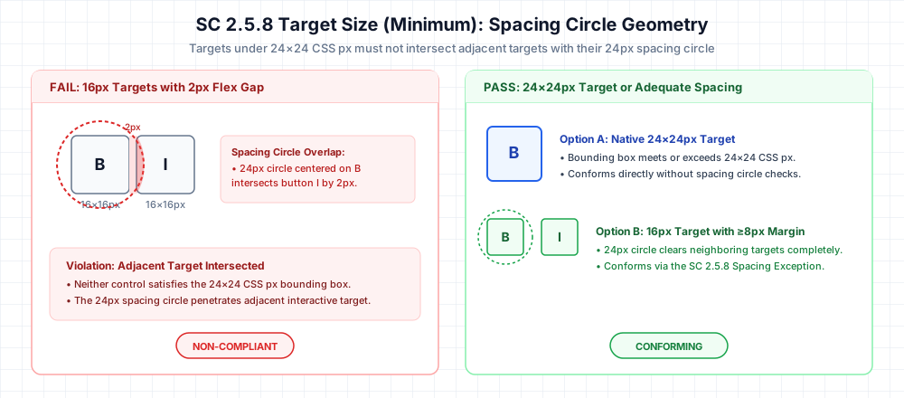
View diagram geometric breakdown
Failing collision (Left): Two toolbar icon buttons (Bold and Italic) have physical bounding boxes measuring 16×16 CSS pixels and are separated by a 2px margin. Because 16px is below the 24px minimum, the spacing exception must be evaluated. Centering a 24px diameter circle on the Bold button extends its 12px radius 4px past the button edge. Because the margin is only 2px, the circle penetrates 2px into the adjacent Italic button. Because the spacing circle intersects an adjacent target, it fails SC 2.5.8.
Solution A (Direct Conformance): Increasing the button dimensions to at least 24×24 CSS pixels with CSS min-width and min-height conforms immediately without requiring spacing circle calculations.
Solution B (Spacing Exception Conformance): Keeping the 16×16px button visual size while expanding the separation margin to 8px ensures that 24px diameter circles centered on each button never intersect adjacent targets or their spacing circles, passing SC 2.5.8 under the spacing exception.
<!-- Fails 2.5.8: 16x16px targets with a 2px gap cause spacing circles to intersect -->
<div class="editor-toolbar" role="toolbar" aria-label="Text formatting">
  <button class="tool-btn" style="width: 16px; height: 16px; margin: 0 2px;"><b>B</b></button>
  <button class="tool-btn" style="width: 16px; height: 16px; margin: 0 2px;"><span>I</span></button>
  <button class="tool-btn" style="width: 16px; height: 16px; margin: 0 2px;"><u>U</u></button>
</div>
Look closely at the toolbar above:
Each icon button measures just 16×16 CSS pixels.
Because 16px is below the 24px requirement, we must evaluate the spacing exception.
Centering a 24px diameter circle on the Bold button extends a 12px radius—reaching 4px past each edge.
With only 2px of flex gap between buttons, that circle penetrates 2px directly into the adjacent Italic button bounding box.
Because the spacing circle collides with an adjacent target, the toolbar fails SC 2.5.8.
How to fix it
The cleanest fix is setting minimum dimensions directly in CSS:
/* Ensures at least 24x24px clickable surface area */
.tool-btn {
  min-width: 24px;
  min-height: 24px;
  padding: 4px;
}
Detailed specification: WSS Touch Target Size Specification.
4. Consistent Help (3.2.6 A): Serialized order across templates
If a website provides help mechanisms (such as contact information, support forms, self-help FAQs, or chat widgets), and those mechanisms appear across multiple pages in a set, they must occur in the same relative order with respect to other repeated content (W3C Understanding 3.2.6).
Audit Evidence Artifact (EVID-326-site-17): A customer support chat trigger was serialized inside the
<header>navigation landmark before main content on/faq, but serialized inside the<footer>landmark after main content on/pricing. Both pages shared the identical desktop viewport layout and template structure, demonstrating inconsistent serialized order.
The cross-template reordering failure
Visual inconsistency can be a usability issue, but WCAG 3.2.6 specifically evaluates relative serialized order in the DOM. A failure occurs when a repeated help mechanism shifts its position relative to other repeated landmarks across equivalent page templates:
<!-- Page A: /products -->
<!-- Serialized Order: Header -> Main Content -> Support Link (in footer) -->
<header class="global-header"><nav><a href="/">Home</a></nav></header>
<main id="content"><h1>Products</h1></main>
<footer class="global-footer">
  <a href="/contact" class="help-link">Support Desk</a>
</footer>

<!-- Page B: /faq -->
<!-- Serialized Order: Header -> Support Link (in header) -> Main Content -->
<header class="global-header">
  <nav>
    <a href="/">Home</a>
    <a href="/contact" class="help-link">Support Desk</a>
  </nav>
</header>
<main id="content"><h1>FAQ</h1></main>
<footer class="global-footer"><p>© 2026</p></footer>
On Page A, the help link appears after main content in the footer.
On Page B, it appears before main content in the header.
Because the support link changes its relative position across repeated templates without user initiation, it fails 3.2.6.
The psychological disruption is immediate: when users with cognitive disabilities or screen reader users learn that a support channel lives in the header, forcing them to hunt through the footer on the next route breaks their learned mental model.
Note that this consistency requirement applies across equivalent page templates within the same layout variation. Responsive breakpoint shifts (such as a footer link moving into a mobile hamburger drawer) do not violate 3.2.6 because they reflect different viewport modes rather than template inconsistency.
How to test
- Find repeated help mechanisms: chat widgets, support email links, phone numbers, or FAQ links.
- Compare equivalent page variations within the same viewport mode and orientation; do not treat responsive layout adaptations (such as mobile drawer collapse) as an inconsistency across templates.
- Check the serialized DOM order of the help mechanism relative to other repeated content across at least three distinct templates (such as homepage, product page, and account page).
- Confirm that the help mechanism appears in the same relative position across each template.
Detailed specification: WSS Consistent Help Specification.
5. Redundant Entry (3.3.7 A): Multi-step workflow memory
Information previously entered by or provided to the user that is required again in the same process must be either auto-populated or available for selection (W3C Understanding 3.3.7).
Audit Evidence Artifact (EVID-337-site-02): In a multi-step checkout workflow on
/checkout, entering complete billing information in Step 1 and proceeding to Step 2 presented blank shipping address inputs with no auto-fill, no “Same as billing” toggle, and no stored address selection mechanism.
Where redundant entry occurs
Here is what this failure looks like in practice:
Step 1: The user painstakingly types their full billing address and proceeds to the next screen.
Step 2: The checkout asks for a shipping address—and presents completely blank inputs.
No autofill. No “Same as billing” toggle. No stored address selector.
For users with cognitive fatigue, motor impairments, or memory challenges, forcing repeated entry in a single continuous process creates unnecessary errors and friction. Under SC 3.3.7, this is a direct failure.
Step 1: Billing Address ──► User enters "1042 Market St, 94103" ──► Saved in session state
                                                                           │
Step 2: Shipping Address ──► Form presents blank inputs without autofill ──► FAIL
(Note: SC 3.3.7 applies within the same continuous process. It does not require preserving data across completely separate visits or unrelated transactions.)
How to test
- Walk through multi-step workflows: checkout funnels, registration wizards, or multi-page applications.
- In Step 1, enter personal or address details.
- In Step 2, if the workflow asks for that information again, check whether it is auto-populated or available via a selection control (such as a “Same as billing address” checkbox).
- Verify whether an exception applies: re-entering the information is essential, required for security (such as re-entering a password), or previously entered data is invalid.
<!-- Conforms to 3.3.7: Allows user to reuse previously entered billing data -->
<div class="form-group">
  <label>
    <input type="checkbox" id="copy-billing" onchange="syncBillingAddress(this)">
    Same as billing address
  </label>
</div>

<div class="form-group">
  <label for="ship-address">Street Address</label>
  <input type="text" id="ship-address" name="shipping_address" value="1042 Market St">
</div>
Automated linters miss this failure because they evaluate Step 2 as an isolated form with valid labels and input fields.
Detailed specification: WSS Redundant Entry Specification.
6. Accessible Authentication (3.3.8 AA): Cognitive tests and paste support
A cognitive function test is not required for any step in an authentication process unless an alternative method is provided or a mechanism is available to assist the user (W3C Understanding 3.3.8).
Audit Evidence Artifact (EVID-338-site-03): On route
/auth/two-factor, a 6-digit one-time passcode verification field blocked clipboard paste viaonpaste="return false"and declaredautocomplete="off". No WebAuthn passkey or email magic link alternative was offered. Blocking paste eliminated password manager injection and clipboard assistance, forcing the user into an unaided cognitive transcription test in violation of SC 3.3.8.
Cognitive function tests and assistance mechanisms
Remembering a password, transcribing an arbitrary one-time verification code, or solving a CAPTCHA puzzle is a cognitive function test.
Under W3C guidance, an authentication step conforms if a qualifying alternative path is provided (such as WebAuthn passkeys or magic links) or if a mechanism is available to assist the user. W3C explicitly recognizes password manager integration and clipboard copy/paste as mechanisms that assist users by removing the cognitive burden of memorization and transcription.
In our audit, we classified failures under the following precise standard: the authentication flow required a cognitive function test and provided neither an alternative nor a qualifying assistance mechanism. Paste blocking served as the contributing condition and observable evidence that eliminated clipboard assistance and automated credential injection.
Here is the familiar authentication trap:
The user receives an arbitrary 6-digit verification code.
They copy the code to their clipboard and switch back to the browser window.
They attempt to paste the code—and nothing happens. The input field has blocked paste with onpaste="return false".
Now the user is forced into an unaided cognitive test: memorizing the number sequence and transcribing it digit-by-digit.
Because no alternative authentication mechanism (such as WebAuthn passkeys or magic links) is provided, eliminating clipboard assistance directly violates SC 3.3.8.
<!-- Fails 3.3.8: onpaste="return false" blocks clipboard assistance -->
<form action="/auth/verify" method="POST">
  <label for="security-code">Enter 6-digit code</label>
  <input
    type="text"
    id="security-code"
    name="code"
    maxlength="6"
    onpaste="return false;"
    autocomplete="off"
  >
  <button type="submit">Verify</button>
</form>
How to fix it
Enable clipboard paste and configure standard autocomplete tokens so password managers and browser OTP autofill can inject credentials:
<!-- Conforms to 3.3.8: Allows clipboard paste and token autofill -->
<input
  type="text"
  id="security-code"
  name="code"
  inputmode="numeric"
  autocomplete="one-time-code"
>
Configuring autocomplete attributes is a recommended implementation check to support autofill mechanisms, while the normative test is ensuring the user is not subjected to an unaided cognitive function test.
Detailed specification: WSS Accessible Authentication Specification.
Playwright test: evaluating focus obscuration with 2D intersection
Automated tools like axe-core do not check whether a focused element is visually covered by a sticky header. You can write an end-to-end integration test in Playwright to verify 2D geometric clearance:
// test-wcag22-focus-obscured.spec.js
import { test, expect } from "@playwright/test";
import AxeBuilder from "@axe-core/playwright";

test.describe("Focus Not Obscured (2.4.11) Verification", () => {
  test("Detects when a sticky header completely obscures a focused element", async ({ page }) => {
    await page.setContent(`
      <header style="position: sticky; top: 0; height: 72px; width: 100%; background: #0f172a; z-index: 50;">
        <nav><a href="#home" style="color: #fff;">Dashboard</a></nav>
      </header>
      <div style="height: 600px;">Content spacer...</div>
      <button id="target-btn" style="padding: 10px; height: 40px; width: 120px;">Save Data</button>
    `);

    // Standard automated scan returns zero violations
    const axeResults = await new AxeBuilder({ page })
      .withTags(["wcag2a", "wcag2aa", "wcag22aa"])
      .analyze();
    expect(axeResults.violations).toEqual([]);

    // Focus the button via keyboard navigation
    await page.locator("#target-btn").focus();

    const buttonBox = await page.locator("#target-btn").boundingBox();
    const headerBox = await page.locator("header").boundingBox();

    // Calculate 2D rectangle complete enclosure
    // SC 2.4.11 Level AA fails when the focused component is 100% hidden by author-created content
    // A component is completely obscured when its bounding box is entirely enclosed within the obscuring header's bounding box
    const isHorizontallyEnclosed =
      buttonBox.x >= headerBox.x &&
      buttonBox.x + buttonBox.width <= headerBox.x + headerBox.width;

    const isVerticallyEnclosed =
      buttonBox.y >= headerBox.y &&
      buttonBox.y + buttonBox.height <= headerBox.y + headerBox.height;

    const isCompletelyObscured = isHorizontallyEnclosed && isVerticallyEnclosed;

    // This Playwright test demonstrates one specific limitation where static scans pass but runtime geometry obscures focus
    expect(isCompletelyObscured).toBe(true);
  });
});
Cross-browser layout observations
During our cross-browser testing across Chrome 151, Firefox 154, and Safari 26.6, we recorded several practical implementation behaviors:
1. WebKit (Safari 26.6 on macOS & iOS)
- Observed browser behavior: In our Safari testing, declaring
scroll-padding-toponbodybehaved inconsistently during programmatic focus transitions. Applying it directly on the roothtmlselector provided reliable clearance across all tested routes. - WSS testing recommendation: In our development fixtures, we declare
scroll-padding-topdirectly onhtmlrather thanbodyto ensure consistent scroll offsets. - Observed browser behavior (iOS): On iOS Mobile Safari, when the software keyboard appears, fixed and sticky footers shift upward into the viewport, occasionally covering inputs focused near the bottom. Test form inputs on physical touch devices or within the iOS Simulator.
2. Chromium (Chrome 151 on macOS & Windows 11)
- Observed browser behavior: When parent containers use
overflow: hiddenat browser zoom levels above 150%, focus rings on buttons placed near container boundaries were clipped by the overflow edge. - WSS testing recommendation: In our desktop Chrome testing, credential autofill popovers frequently rendered over immediately adjacent form controls. We recommend maintaining at least 12px vertical separation between authentication inputs to avoid focus overlap.
3. Gecko (Firefox 154 on Windows 11)
- Observed browser behavior: When Tab focus moves into a nested container (
overflow-y: auto), Firefox scrolls both the container and the window. Declaringscroll-padding-toponhtmlalone did not prevent sticky container headers from obscuring children; the nested container must declare its ownscroll-padding-top. - WSS testing recommendation: Any container configured with
overflow-y: autothat contains sticky headers should declare its own localizedscroll-padding-top.
WCAG 2.1 to 2.2 AA delta checklist
2.4.11 Focus Not Obscured (Minimum) (AA)
- Tab through every interactive control on each template; verify no element is 100% hidden behind sticky headers, footers, or banners.
- Verify scroll-padding-top on html accounts for sticky header height plus a clearance buffer.
- Re-test keyboard focus with browser zoom set to 200%.
2.5.7 Dragging Movements (AA)
- List all dragging interactions (reordering lists, sliders, file drops, carousels).
- Confirm each action can be performed with single-pointer click or tap controls.
- Confirm click controls are visible without requiring an initial drag gesture.
2.5.8 Target Size (Minimum) (AA)
- Inspect standalone controls (icon buttons, toolbars, pagination, modal close buttons).
- Confirm clickable bounding boxes meet at least 24×24 CSS pixels.
- If the target is below 24×24 CSS pixels, check all five exceptions (spacing, equivalent, inline, user agent control, essential) before recording a failure.
- For controls relying on spacing, verify that a 24px diameter circle centered on the target does not intersect neighboring targets or their circles.
3.2.6 Consistent Help (A)
- Document all help access points (chat widgets, contact links, phone numbers, FAQs).
- Compare equivalent page variations within the same viewport mode and orientation; do not treat responsive layout adaptations (such as mobile drawer collapse) as an inconsistency across templates.
- Verify repeated help mechanisms appear in the same relative serialized order across all page templates.
3.3.7 Redundant Entry (A)
- Test multi-step workflows (checkout, onboarding, registration).
- Confirm information entered in step 1 is auto-populated or selectable in step 2.
- Check if an exception applies (re-entry essential, required for security, or data invalid).
3.3.8 Accessible Authentication (Minimum) (AA)
- Test all login, registration, and password recovery forms.
- Verify authentication does not require an unaided cognitive function test (memory, transcription, or puzzle-solving) without an alternative path or qualifying assistance mechanism.
- Verify clipboard paste is supported on all password and verification fields.
- Ensure autocomplete attributes are configured for password manager autofill.
Frequently asked questions
Does WCAG 2.2 require manual testing?
Yes. While automated tools like axe-core check syntax, labels, and contrast, full WCAG 2.2 AA conformance requires manual evaluation. Automated scanners cannot evaluate runtime keyboard scrolling collisions (2.4.11), physical dragging alternatives (2.5.7), cross-template serialization order (3.2.6), or multi-step session memory (3.3.7).
Is WCAG 2.2 backward compatible with WCAG 2.1?
Yes. Any web page that conforms to WCAG 2.2 AA also conforms to WCAG 2.1 AA. WCAG 2.2 adds nine new success criteria without relaxing existing requirements, and removed 4.1.1 Parsing (which was already satisfied by modern HTML living standard parsers).
Is target size always required to be 24×24 CSS pixels?
No. SC 2.5.8 defines 24×24 CSS pixels as the baseline, but provides five normative exceptions: spacing circle separation, equivalent on-page controls, inline links within text blocks, unmodified user agent controls, and essential presentations (such as map markers).
Does keyboard support satisfy SC 2.5.7 Dragging Movements?
No. Adding keyboard shortcuts or arrow key navigation is a best practice for keyboard users, but SC 2.5.7 specifically requires an alternative for pointer users (such as mouse, eye tracking, or head pointer users) who cannot sustain continuous contact during drag gestures. A single-pointer alternative like a click button or menu is required.
Does blocking paste always cause an SC 3.3.8 failure?
Blocking paste causes a failure if the authentication flow relies on a cognitive function test (such as transcribing a one-time code or recalling a password) and provides no alternative method (such as WebAuthn passkeys or magic links). Blocking paste eliminates clipboard and password manager assistance, leaving the user with an unaided cognitive test.
Does a passing axe-core scan mean WCAG 2.2 AA compliance?
No. In axe-core 4.13.0, WCAG 2.2 AA rules like target-size are disabled by default. Furthermore, automated scanners inspect static DOM snapshots and cannot evaluate runtime scroll clearance, user gestures, or session state transitions.
How do you manually test WCAG 2.2 AA?
Run automated scans to eliminate markup and contrast errors, then perform manual checks across the six criteria:
- Keyboard Tab traversal across sticky headers and footers (2.4.11).
- Pointer single-click tests on drag interfaces (2.5.7).
- Bounding box and spacing circle inspection in DevTools (2.5.8).
- Relative landmark order comparison across route templates (3.2.6).
- Multi-step session flow tests to confirm entered data is retained (3.3.7).
- Clipboard paste and password manager injection tests on authentication fields (3.3.8).
What happened to 4.1.1 Parsing?
4.1.1 Parsing was marked obsolete and removed in WCAG 2.2. Modern HTML parsers implement deterministic error-recovery algorithms defined in the HTML Living Standard, making author-level parsing validation redundant for assistive technology.
Does WCAG 2.2 require 44×44px button sizes at AA?
No. SC 2.5.8 requires a minimum target size of 24×24 CSS pixels (or adequate spacing circle separation). The 44×44 CSS pixel target exists under SC 2.5.5, which is an AAA criterion.
Does WCAG 2.2 ban CAPTCHAs?
No. SC 3.3.8 does not ban CAPTCHAs outright. The authentication flow must provide an alternative method or satisfy one of the exceptions (such as object recognition or passive risk-based verification that requires no cognitive task).
Is Focus Appearance (SC 2.4.13) required for WCAG 2.2 AA?
No. Focus Appearance is an AAA criterion (SC 2.4.13). The AA requirement is SC 2.4.11 Focus Not Obscured (Minimum), which requires that the focused component not be completely hidden by author content.
Primary sources and references
- W3C: What is New in WCAG 2.2
- W3C: WCAG 2.2 Adopted as ISO/IEC 40500:2025
- W3C: ACT Rules Format 1.1 Recommendation (February 2026)
- W3C: Understanding SC 2.4.11 Focus Not Obscured (Minimum)
- W3C: Understanding SC 2.5.7 Dragging Movements
- W3C: Understanding SC 2.5.8 Target Size (Minimum)
- W3C: Understanding SC 3.2.6 Consistent Help
- W3C: Understanding SC 3.3.7 Redundant Entry
- W3C: Understanding SC 3.3.8 Accessible Authentication (Minimum)
- W3C: WCAG 2 FAQ — 4.1.1 Parsing
- Deque axe-core: Rule Descriptions Documentation
- Deque axe-core GitHub Issue #5225: Target Size Rule Limitations
- WSS Focus Not Obscured Specification
- WSS Dragging Movements Specification
- WSS Touch Target Size Specification
- WSS Consistent Help Specification
- WSS Redundant Entry Specification
- WSS Accessible Authentication Specification

Written by
Platform Engineer and Technical Writer with 10+ years of full-stack development experience and 2+ years focused on DevOps and platform engineering.